User Onboarding Is Not About Showing Features. It Is About Getting to Value Fast.
A practical perspective on user onboarding, shaped by years of building and scaling real products, and learning where users actually find value.
A practical perspective on user onboarding, shaped by years of building and scaling real products, and learning where users actually find value.
A good onboarding experience does more than show users where buttons live. It gets them to value quickly, confidently, and with minimal friction. From the very first interaction, users are subconsciously asking one question. Is this going to solve my problem?
If onboarding feels confusing, heavy, or generic, churn begins before value is ever reached. In my experience, the perceived quality of onboarding has a direct impact on activation, retention, and ultimately revenue.
Put simply, a clear journey reduces friction, builds confidence, and prevents early churn. Below is how I think about designing onboarding that actually works.
1. Nail sign up and first impressions
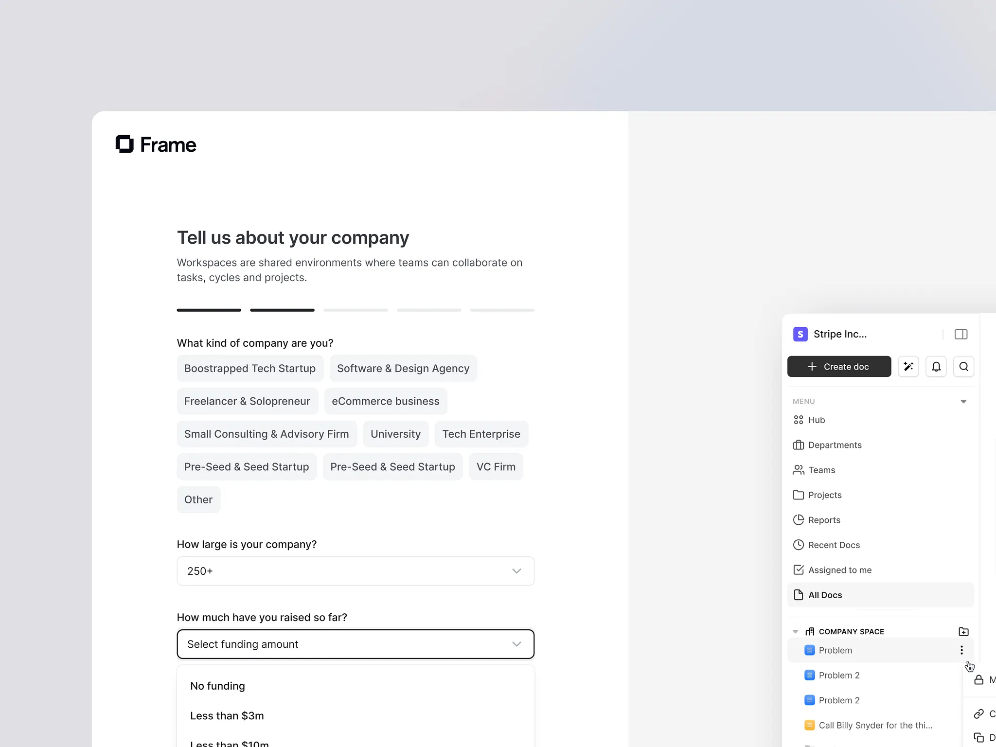
Onboarding starts before users ever see your product.
Every additional field at sign up increases the risk of abandonment. The goal is simple. Remove obstacles and get users inside as fast as possible.
Strong principles to follow:
• Ask for essentials first and defer everything else
• Use SSO, magic links, or passcodes where possible
• Avoid form fatigue wherever you can
A good example of this is Slack. Their onboarding asks for just enough information such as email, workspace name, and who else is involved so that by the time a user lands in the product, it already feels set up for them.
Slack also removes friction by avoiding password creation upfront. Account access is handled via email verification. It is a small detail but it makes a meaningful difference.
First impressions matter beyond day one. A clear welcome screen that explains what happens next reduces confusion. Short checklists or progress indicators help users move forward. Even a small sense of progress early on significantly improves completion.
Keep it short, focused, and intentional.
2. Personalise early without overwhelming users
Users engage more when onboarding reflects their goals.
I have consistently seen stronger activation when onboarding adapts to role, persona, company size, or use case.
The key is contextual guidance rather than content overload.
What works well in practice:
• Different paths for beginner and advanced users
• Tooltips and nudges triggered by behaviour rather than timers
• Showing the next best action based on what the user just did
Micro learning is most effective when it is short, in context, and skippable. The goal is to guide users without interrupting their flow.
3. Design backwards from the Aha moment
The most important question in onboarding is simple. When do users first feel the value?
That Aha moment is when users stop evaluating and start committing.
Once you have identified it, work backwards. Remove any steps that do not accelerate progress. Tie onboarding directly to activation metrics.
Things that consistently help:
• Task based checklists with no more than seven steps
• Visual progress indicators
• Small celebrations when milestones are reached
On one product I worked on, reorienting onboarding entirely around the Aha moment reduced day one churn by over twenty percent.
4. Use email and self serve support to maintain momentum
In app guidance is powerful, but users do not live inside your product.
Well timed emails help maintain momentum:
• A personalised welcome within the first hour
• Follow ups triggered by incomplete actions
• One clear call to action per message
Self serve support is equally important. Most users prefer solving problems themselves as long as the experience is good.
Context aware documentation, in app search, and lightweight AI assistants now make this easier than ever.
The key is relevance. Link users to help that matches their current context. Keep support close to the point of friction. Reduce the need to leave the product.
5. Treat onboarding as a continuous product problem
Onboarding is never finished.
The strongest onboarding systems are owned cross functionally and continuously improved using real data.
What I have seen work well:
• Shared activation metrics across product, marketing, and customer teams
• Regular reviews of onboarding funnels
• Combining analytics with qualitative feedback such as surveys and session replays
Simple habits go a long way. Fortnightly onboarding check ins, reviewing drop off points together, and feeding insights directly into the roadmap all make a measurable difference.
6. Choose tools that support your strategy
Tools can help, but only if they support a clear onboarding strategy.
A modern onboarding stack typically includes in app guidance, behavioural analytics, and self serve support.
The most important factor is integration. Tools should reference the same user events and data so onboarding feels consistent across channels.
A single source of truth will always outperform a collection of disconnected tools.
Final Thought
Great onboarding does not feel like onboarding.
It feels like momentum, clarity, and progress.
When onboarding works well, users barely notice it. They simply reach value faster.
That has always been the goal for me when designing product journeys.